Spriggy Designing Australia’s #1 money app for kids & teens
*This case study is kindly contributed by StudioSpace agency, UntilNow.
Overview
With over 1 million Australians on the platform, Spriggy is a fintech success story. UntilNow has worked alongside their team for many years, playing a key role in their Product Design function. Our input helped define an information architecture that enables Spriggy to expand their product line. With multiple products in market, UntilNow continues to support Spriggy in its mission to teach more kids about money.
UntilNow’s roles:
User Experience
UI Design
Design System
Results:
1M+
Total Australians on Spriggy
50
NPS Score
4.8
Star rating from over 31,000 reviews
Pocket money goes digital
Most parents believe having a day-to-day understanding of money is essential learning for children, however many struggle with how to teach this (or finding the time). With the adult world having migrated largely to online payments, Spriggy’s market entry was perfectly timed. After finding initial traction with the ‘Pocket Money’ app in 2016, the team engaged UntilNow to overhaul their app experience. A more robust and user-friendly app would power Spriggy to scale further.
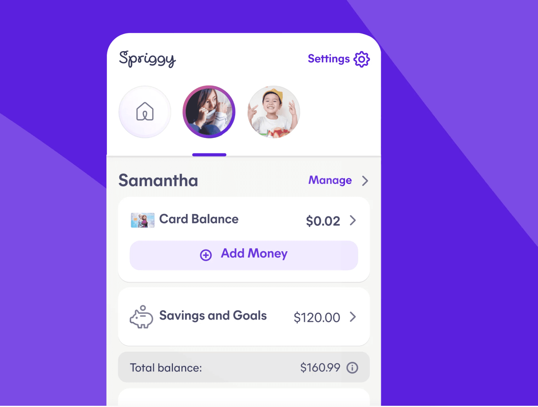
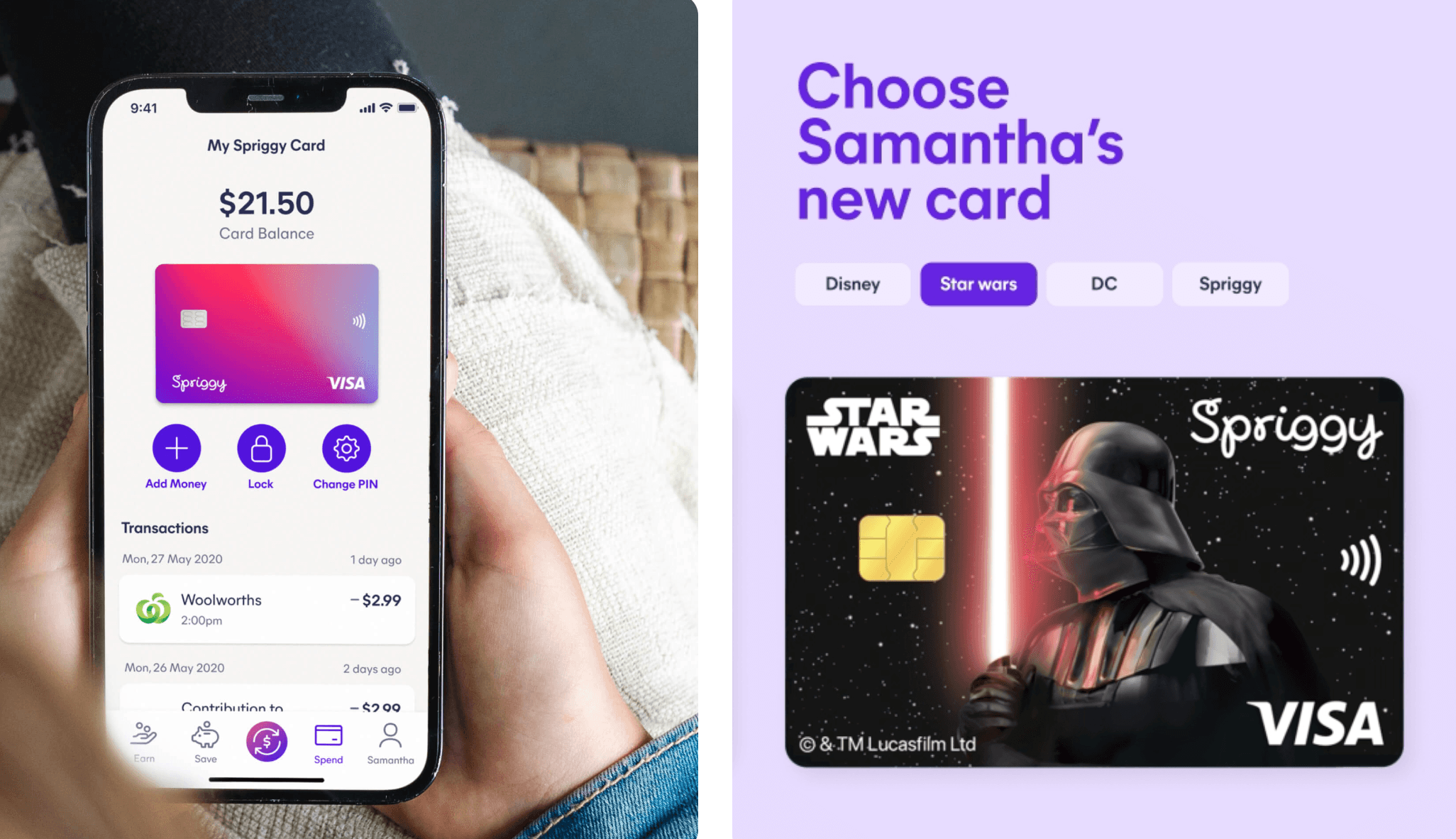
Our first engagement with Spriggy was focused on improving the information architecture of their flagship product. We redesigned key interactions, making it easier for parents to quickly check their children’s card balances, navigate between multiple kids and to load money on to individual cards at speed.
Advanced features such as setting chores and assigning monetary value to them are key teaching moments. Children are motivated by the reward and can use this to build towards savings goals for anything they like - all with a simplified user interface for the children and complete control for parents. The benefit of our close working relationship has meant we can feed in changes and optimisations efficiently, improving the product quicker for Spriggy’s users.
Powering brains (and bellies) with Spriggy Schools
Next, Spriggy invited us to contribute to their Schools app. This product provides a simple payment gateway for everyday school expenses such as uniforms and canteen food. The technology integrates directly with the children’s school canteen to help parents plan and pay for meals during the week. At the merchant end, schools can update their stock - whether it’s a new sandwich or a sports uniform - and load it into the portal for parents to see.
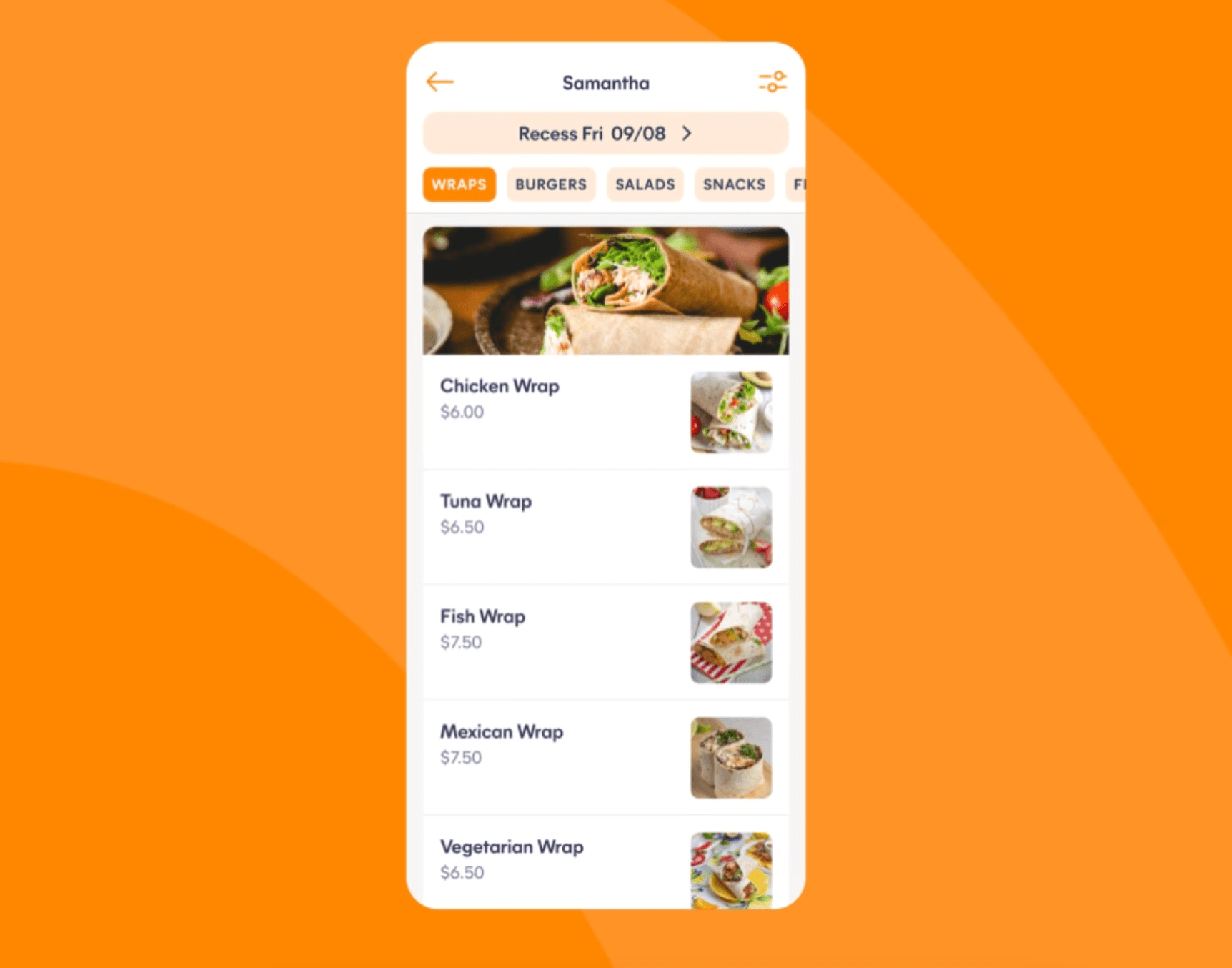
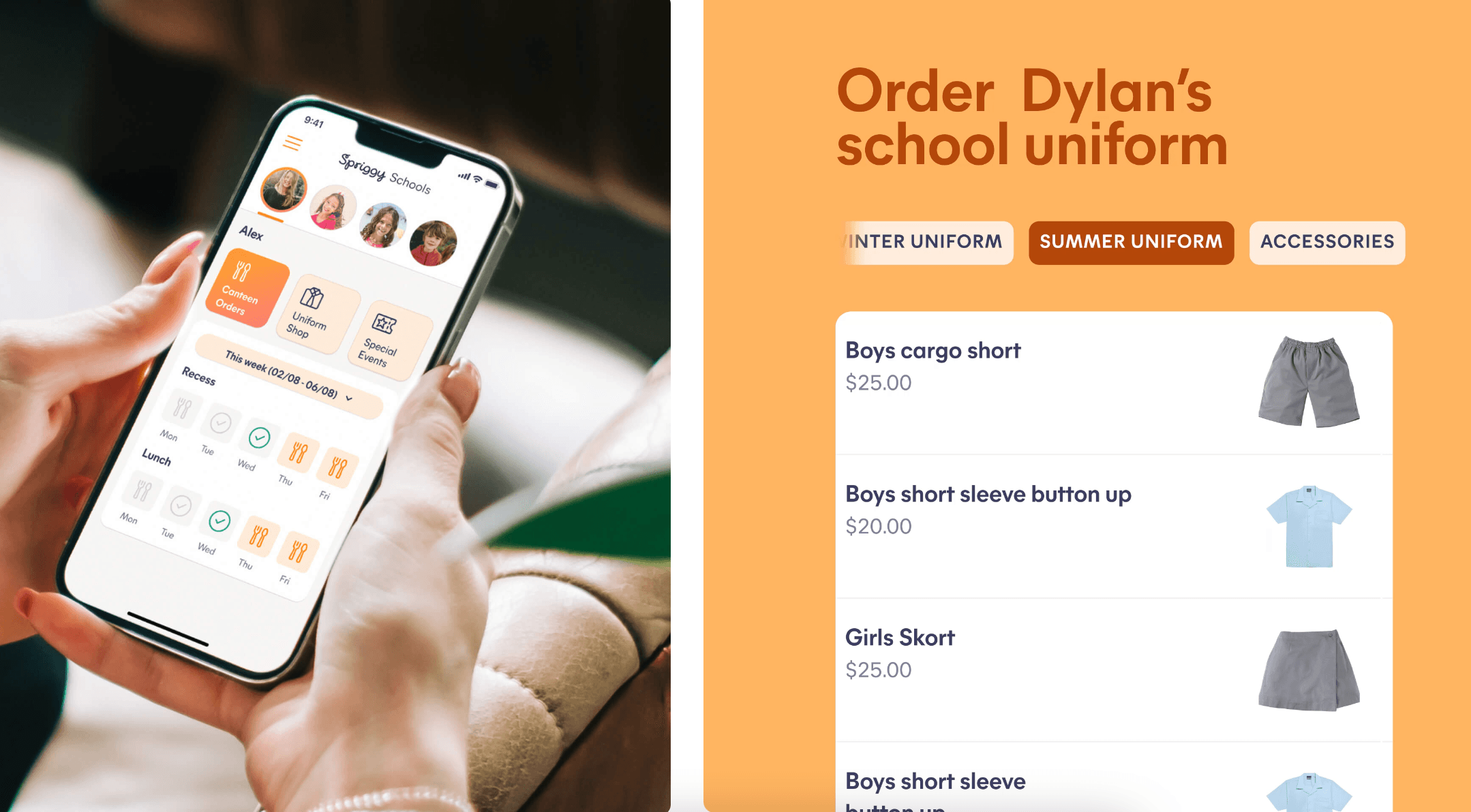
UntilNow supported the Spriggy Schools app in 2 key ways. First, we provided a design experience that modelled the information architecture originally developed for the Pocket Money app. Then we integrated the visual identity to ensure consistency across the suite of products. The Schools app continues to evolve in its user interface design and functionality.
Spriggy Invest launches into the markets
Now that kids could save, spend and earn on the platform, Spriggy wanted to round out the journey of financial literacy by expanding into investing. Enter Spriggy Invest - a sophisticated, yet simple investment platform. UntilNow was instrumental in helping deliver a successful beta design, with innovative UI features such as investment goals.
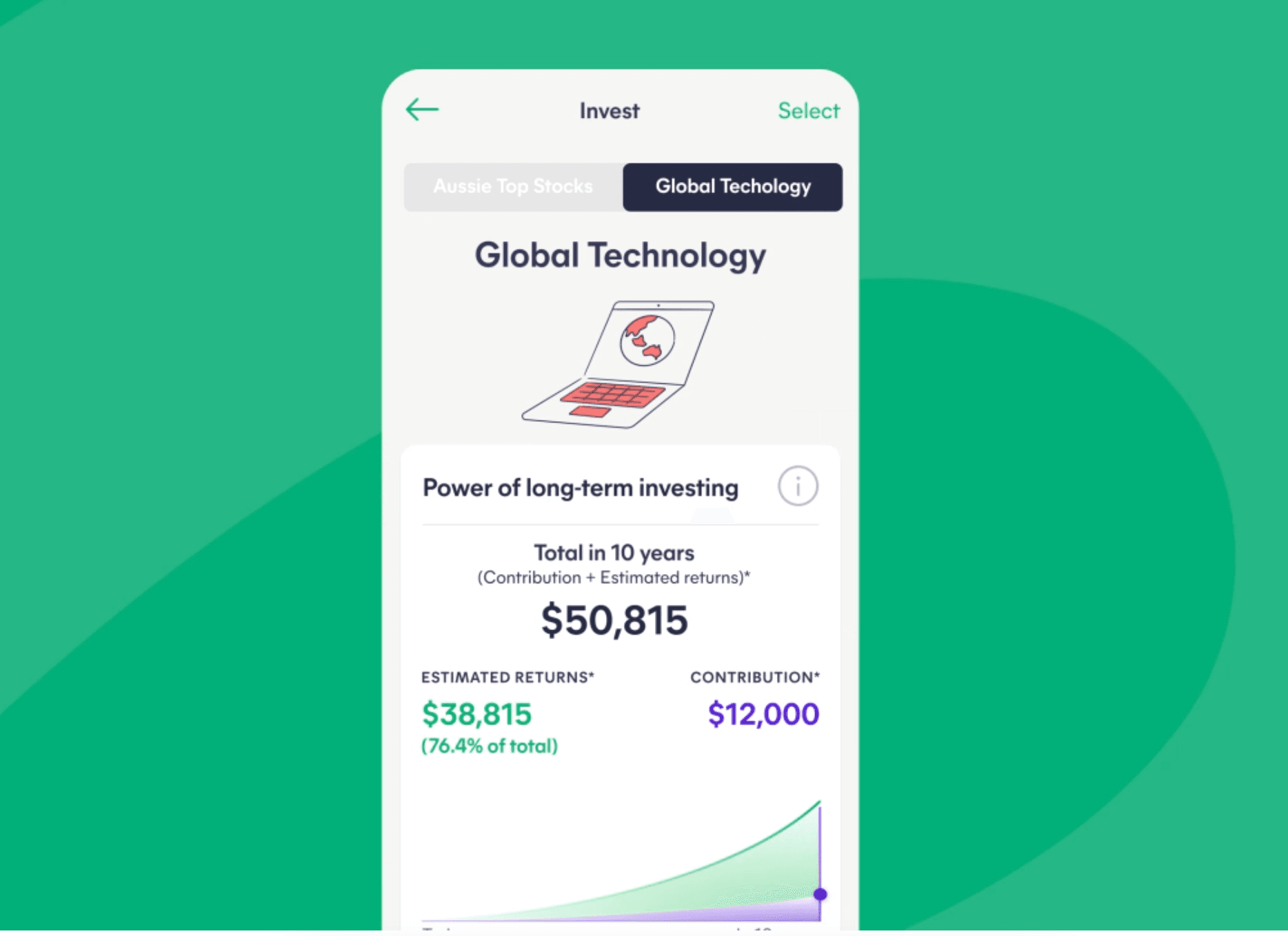
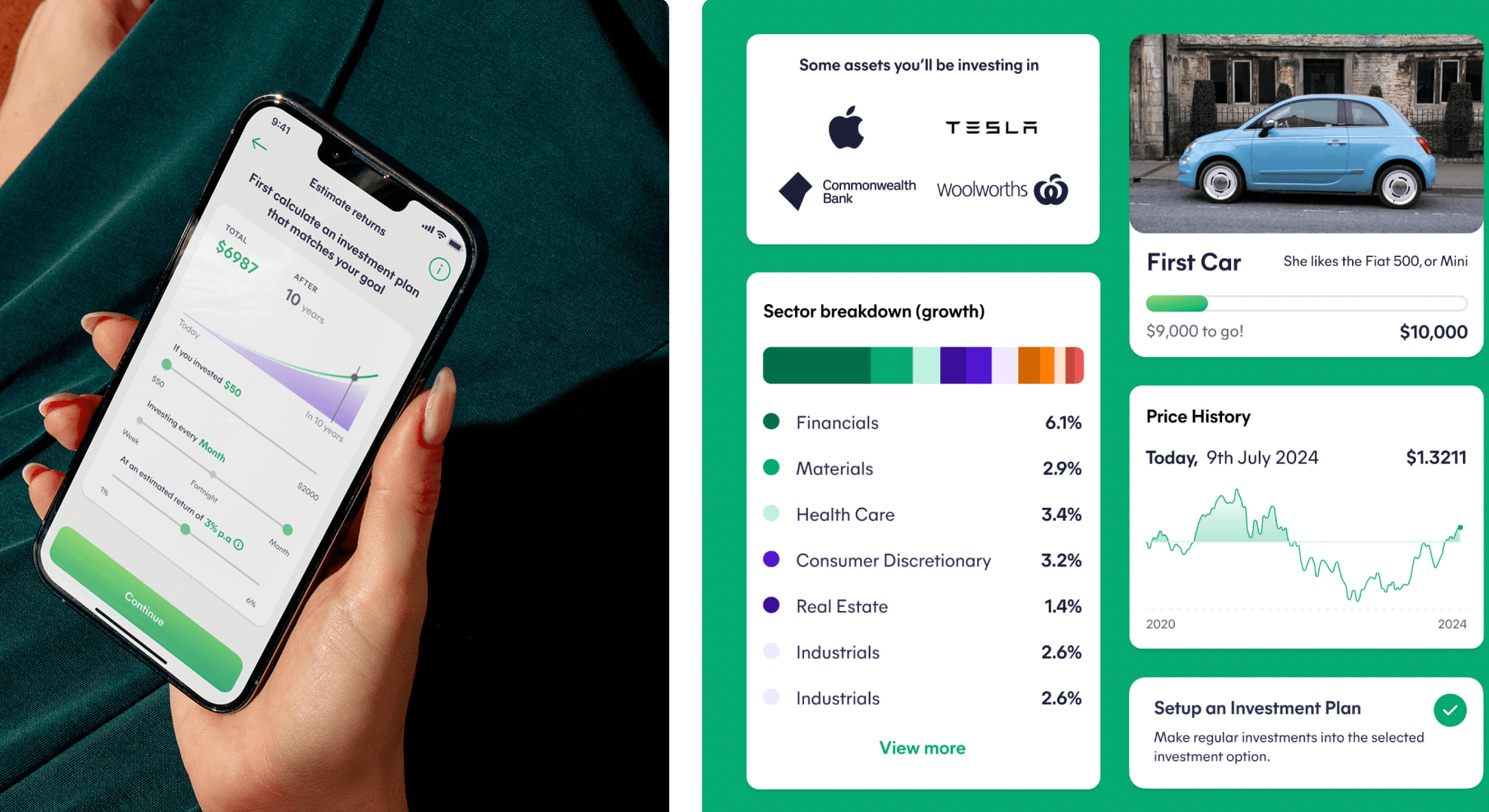
Invest offers 5 options which constitute a blend of ETFs and shares, such as Aussie Top Stocks, Global Technology and a High Growth option, with simple data visualisation that flows consistently from the familiar design system built in Pocket Money. Invest allows parents to invest sooner with their children into the global stock market and help them take advantage of today’s opportunities. To support this experience, the app provides an educational onboarding for parents.
Retaining users with SPRK
As children move into adolescence they seek more independence in their banking and card use. To help maximise customer retention, there were a number of features that would need to be made available. In addition to this, the product would have to strike a balance of extending the Spriggy offering whilst looking and feeling more aligned to the other apps and experiences that this audience were increasingly exposed to.
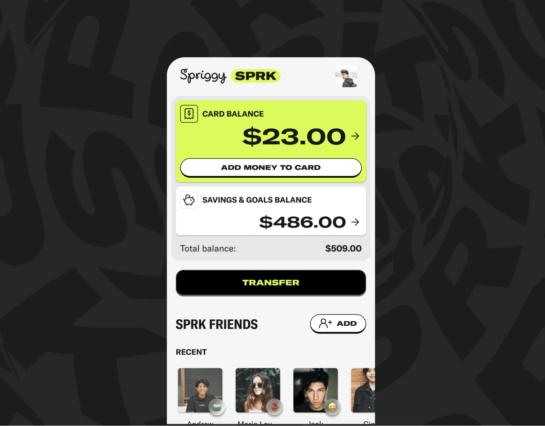
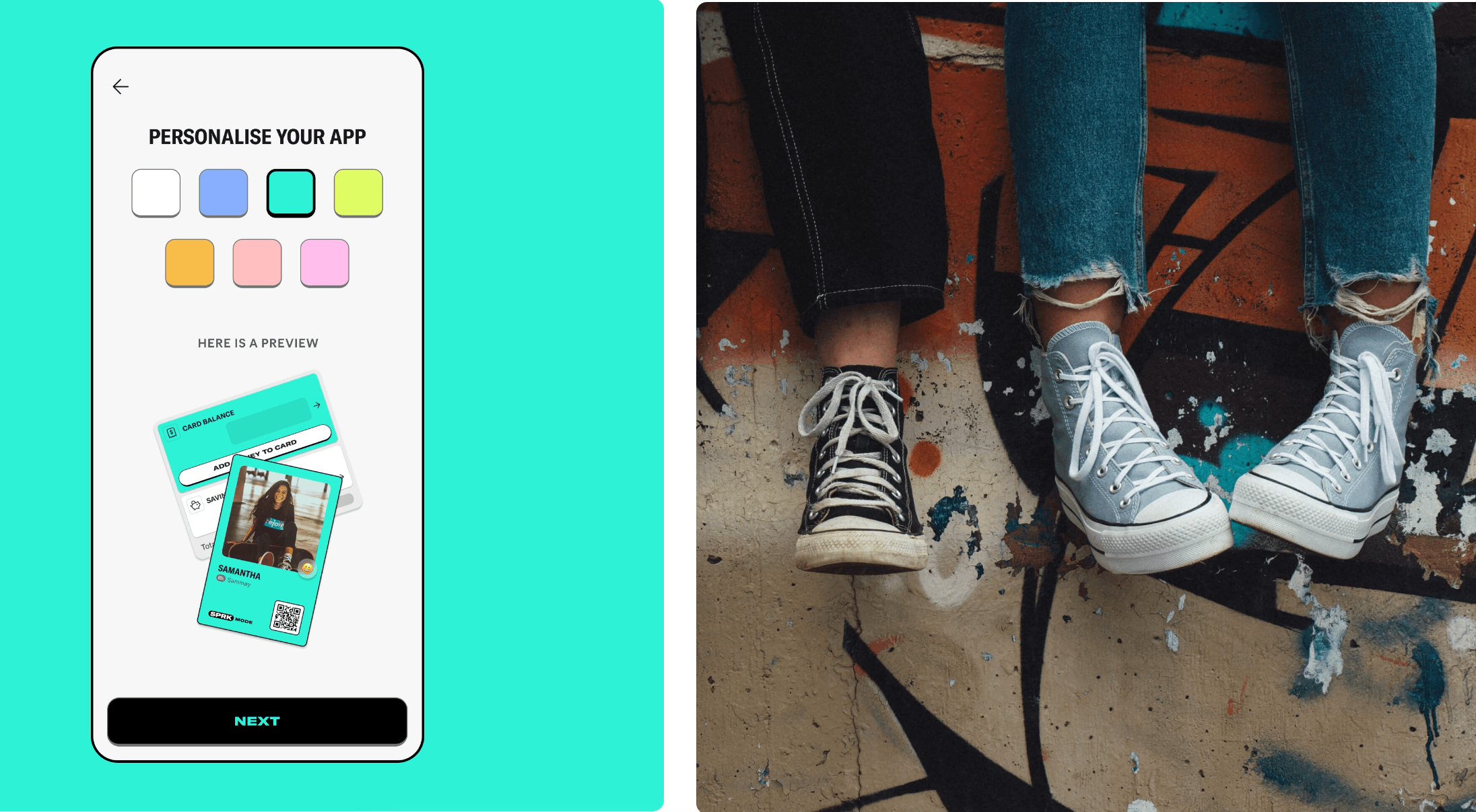
We helped Spriggy launch a teens offering called SPRK mode, with advanced features such as ATM access and instant, peer-to-peer payments between friends. To further drive this differentiation home and cater to this notoriously hard-to-please audience, we applied a new brand design throughout the entire app by working with Spriggy’s Creative Director. With a highly customisable colour palette and a striking new logo, this modern interface resonated strongly with teens and drove higher retention for the product overall.

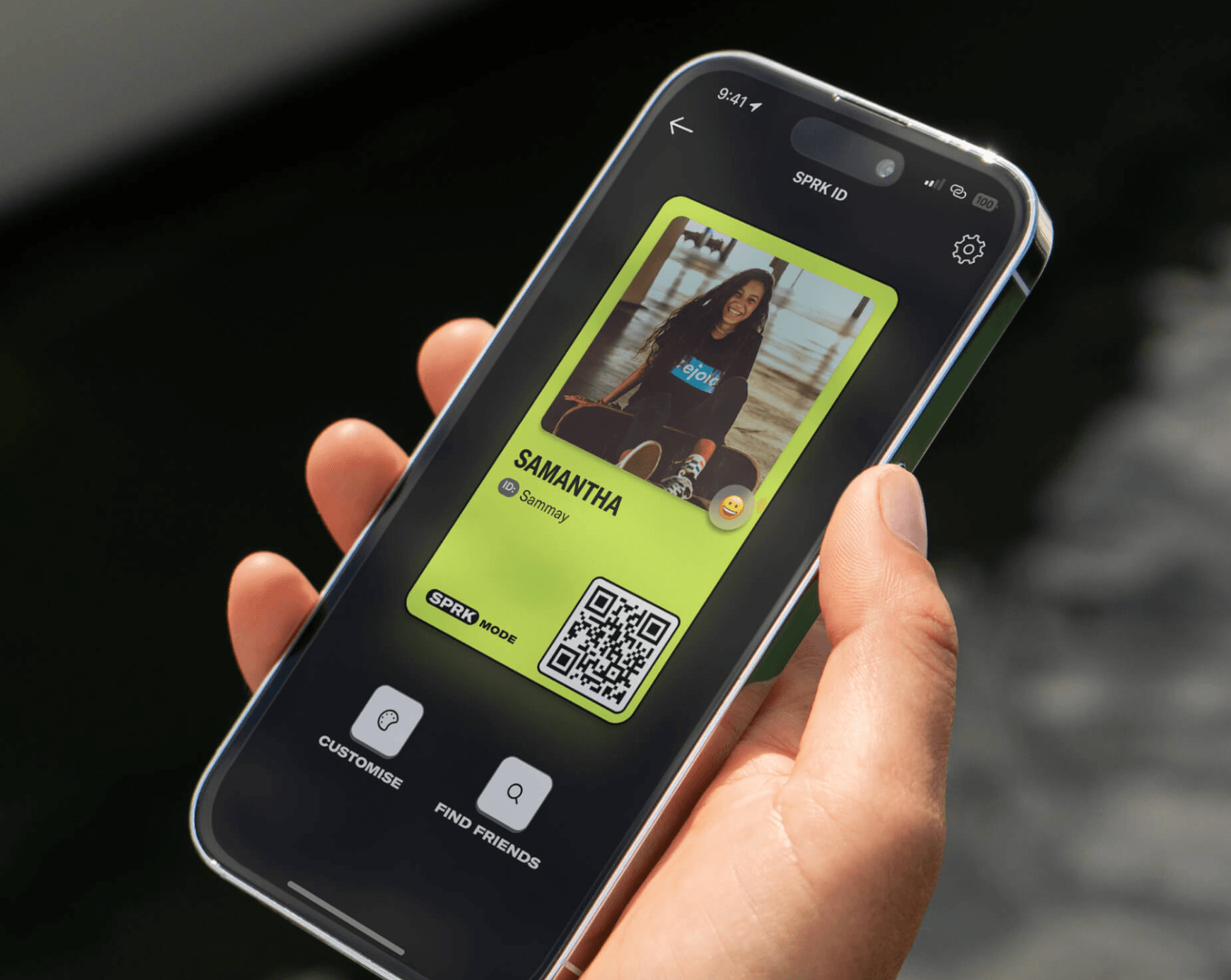
Please note: Images in this case study are representative of UntilNow’s product design for Spriggy in recent years. Some designs have been published live in the products whereas others may have been changed.